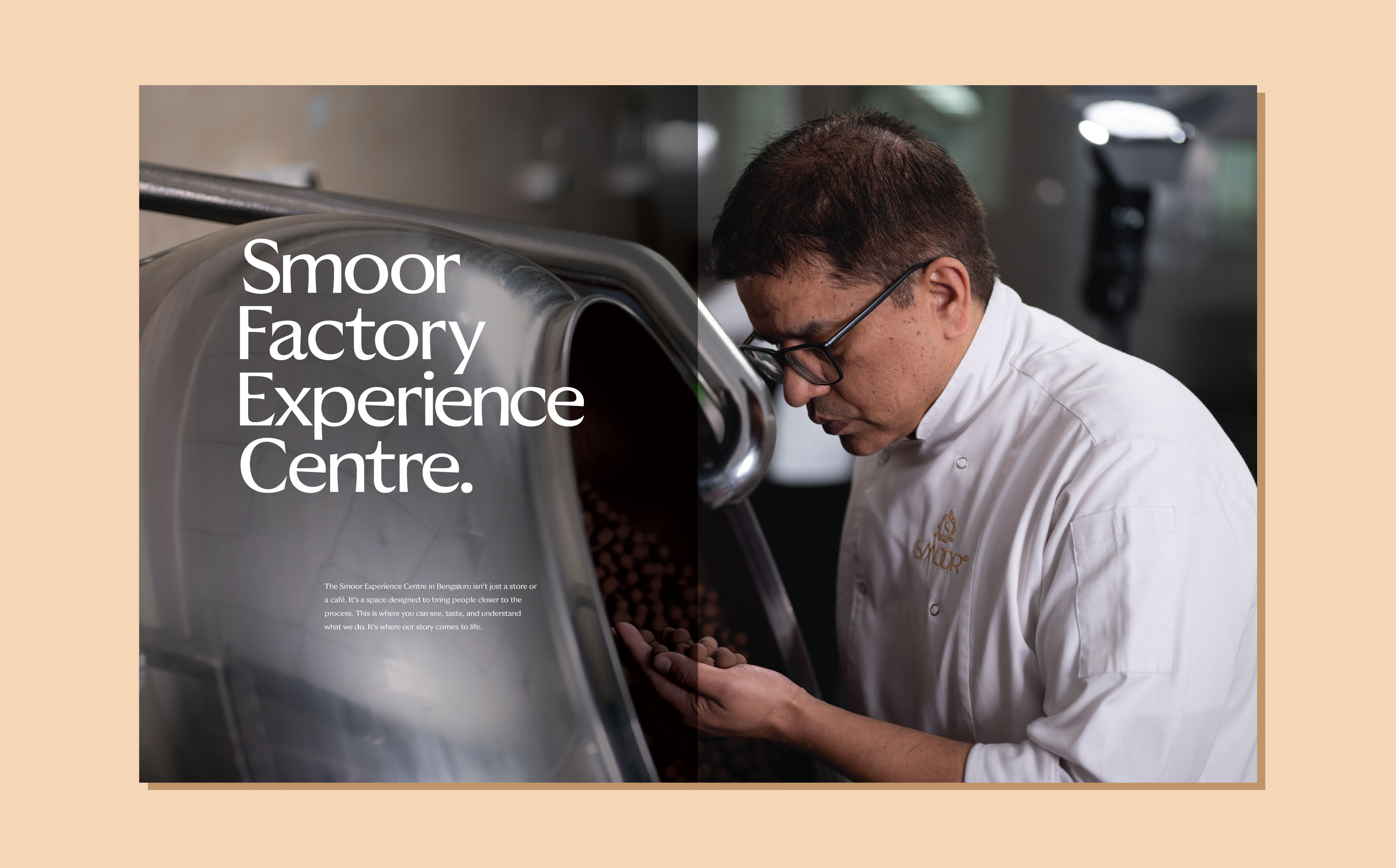
Building a brand platform that connects craft, culture, and people.
Every strong brand eventually reaches a moment where it needs to look at itself again.
Not to change who it is, but to express it more clearly.
For SMOOR, that moment led to the creation of SMOOR 2.0, a new brand platform designed to bring together the many layers of the brand, its craft, its ingredients, its people, and its future ambitions.
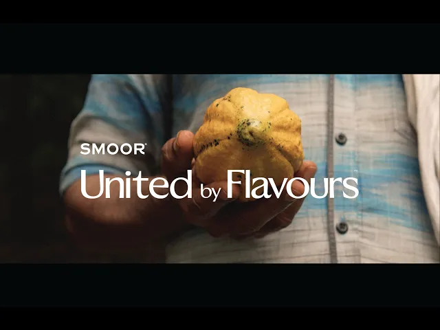
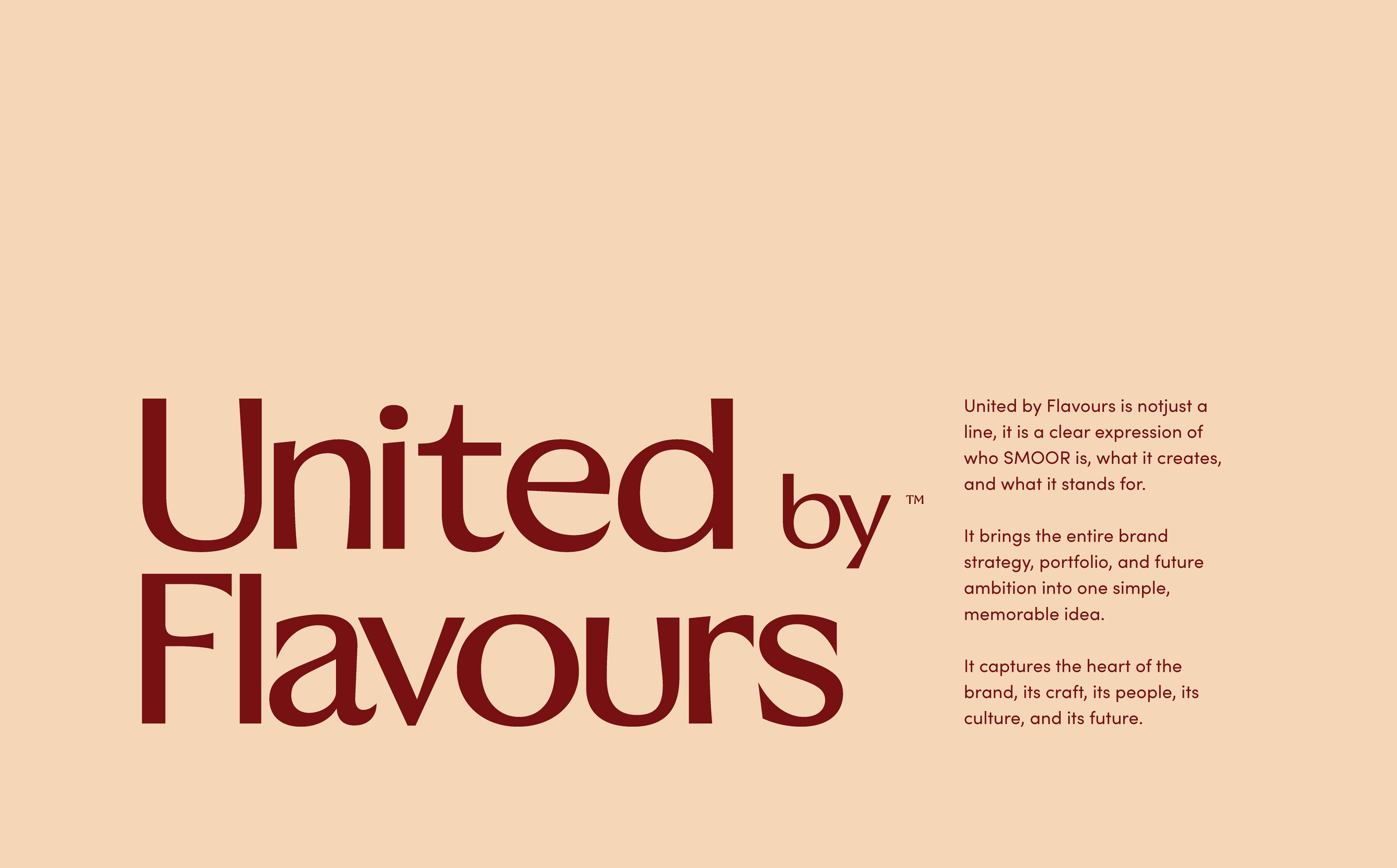
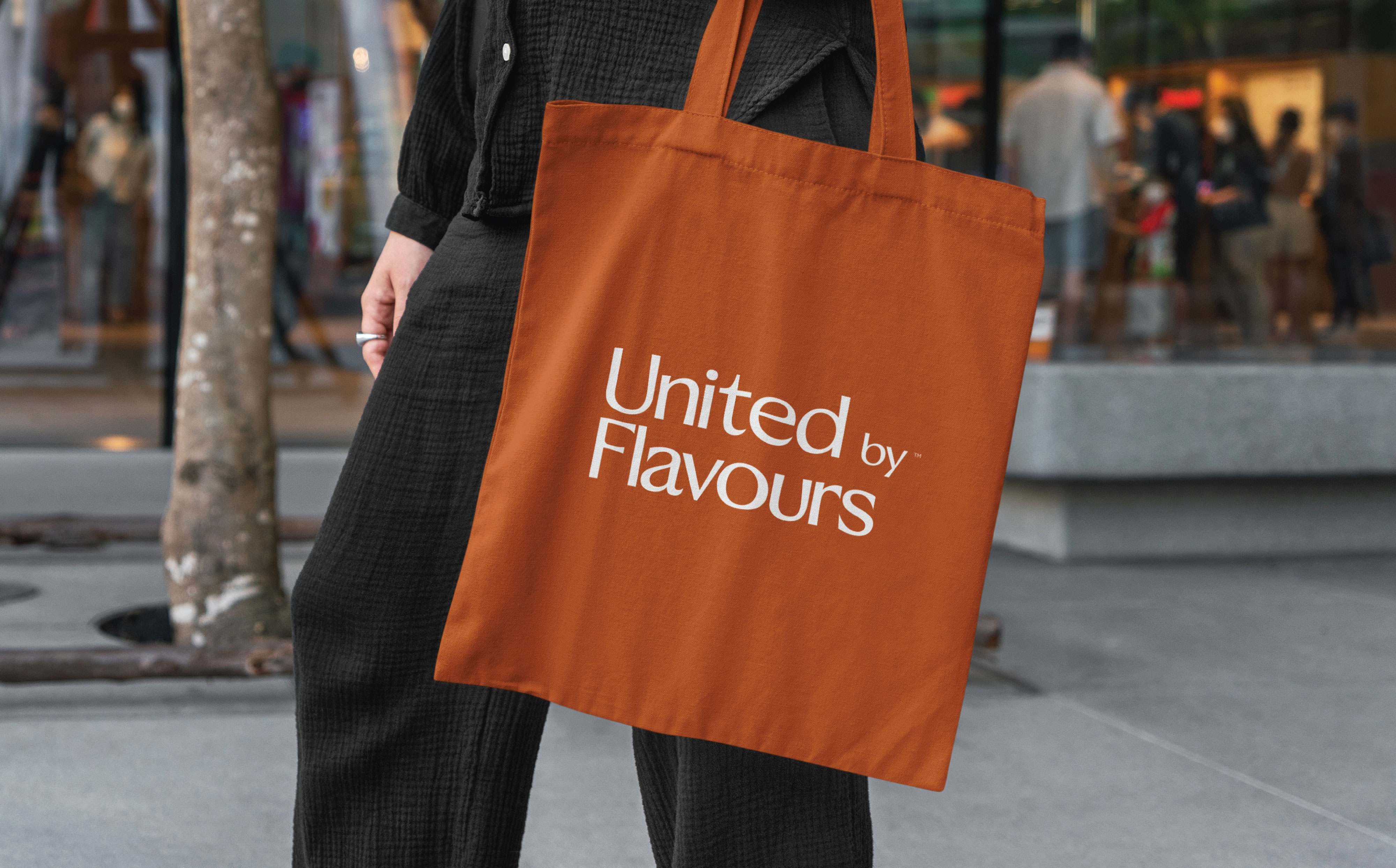
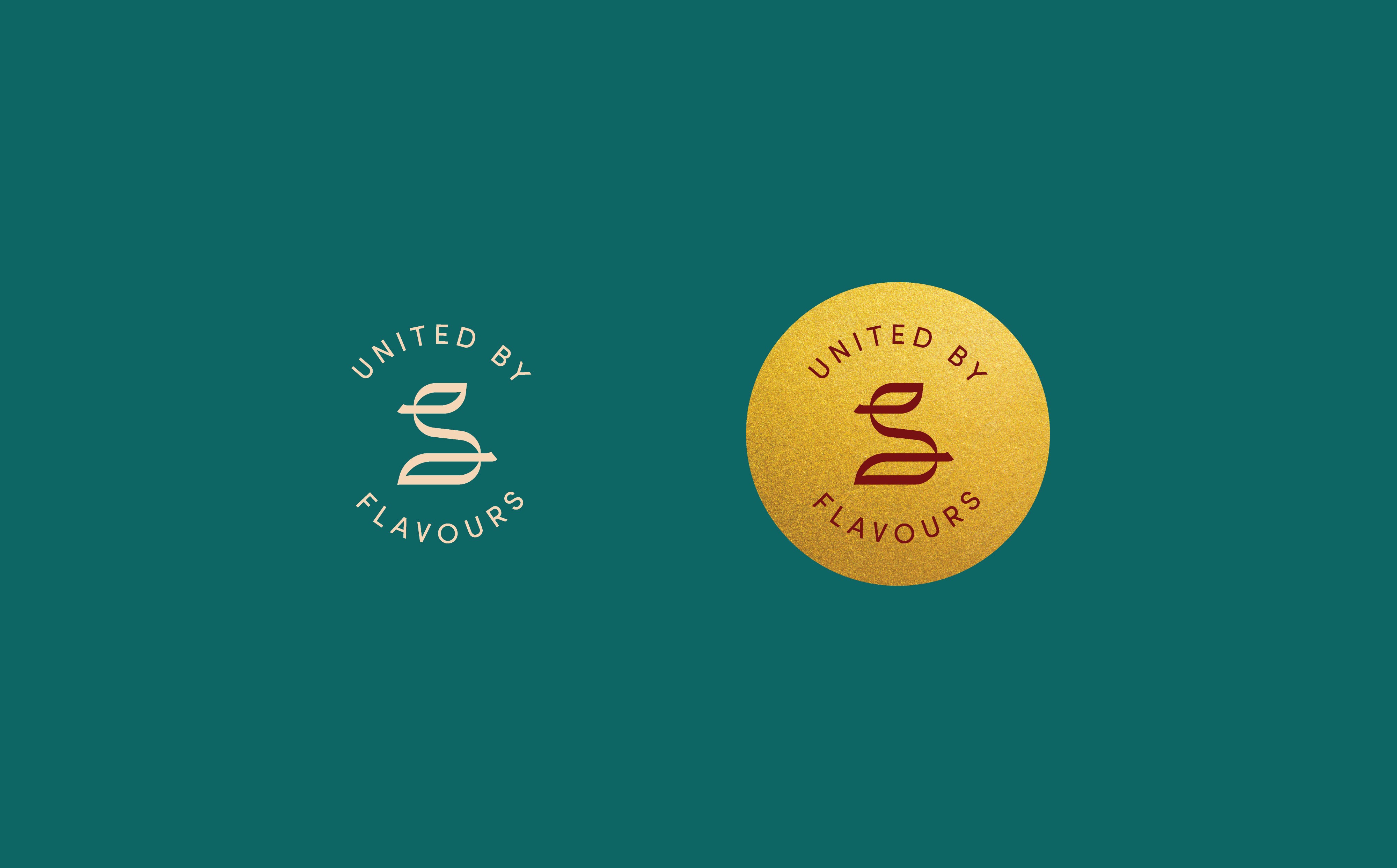
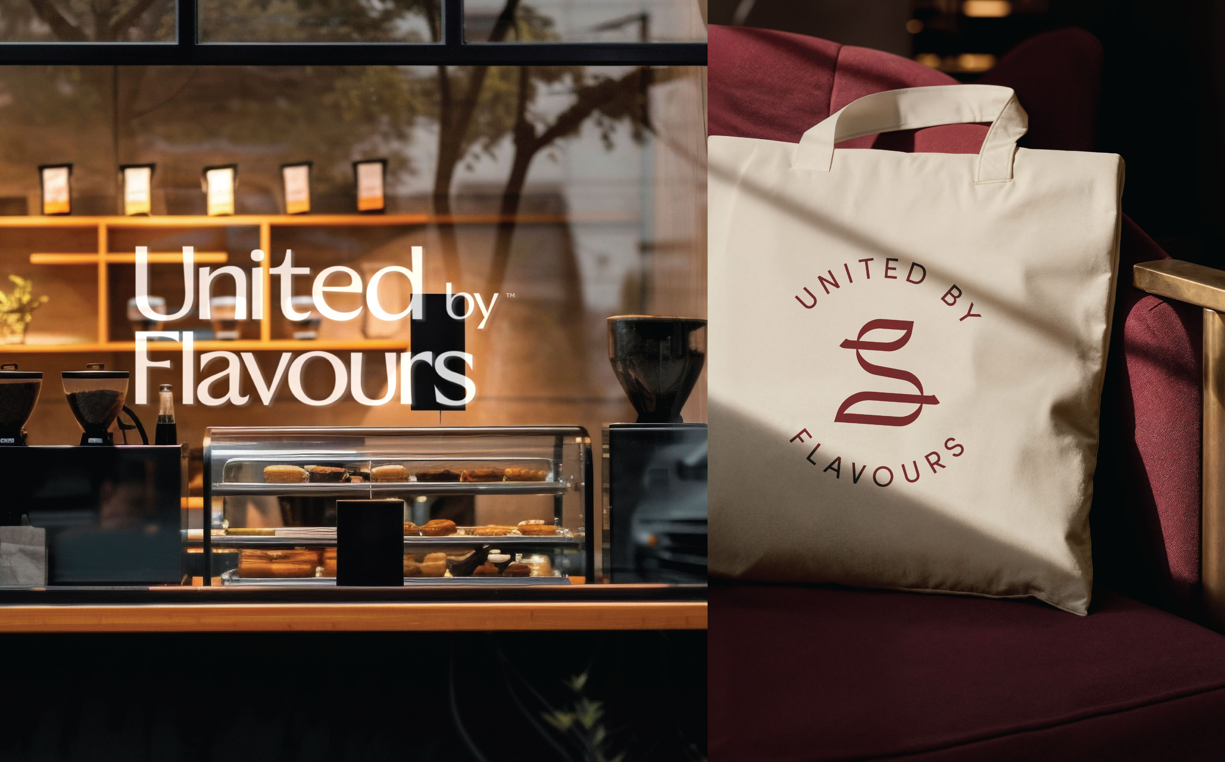
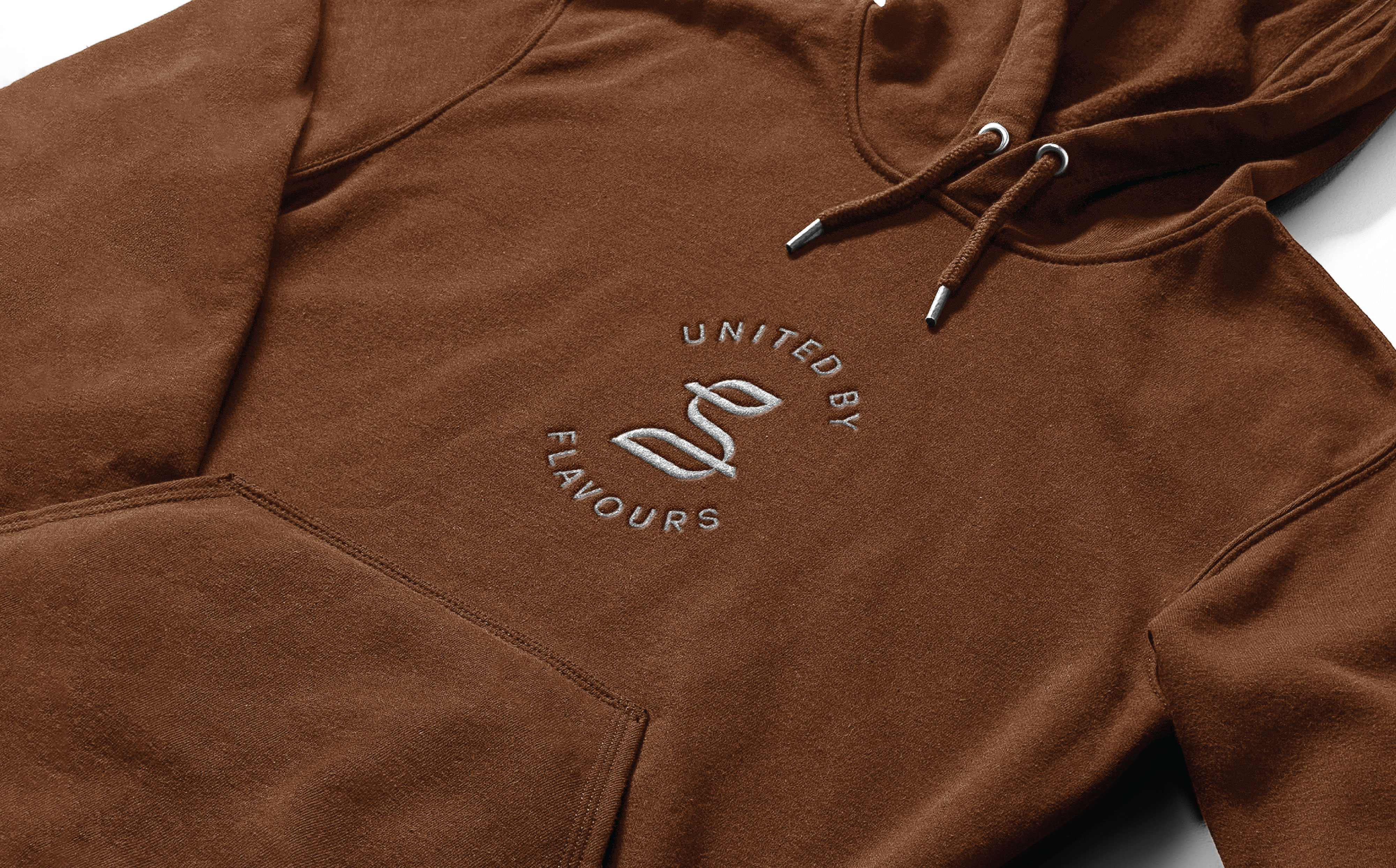
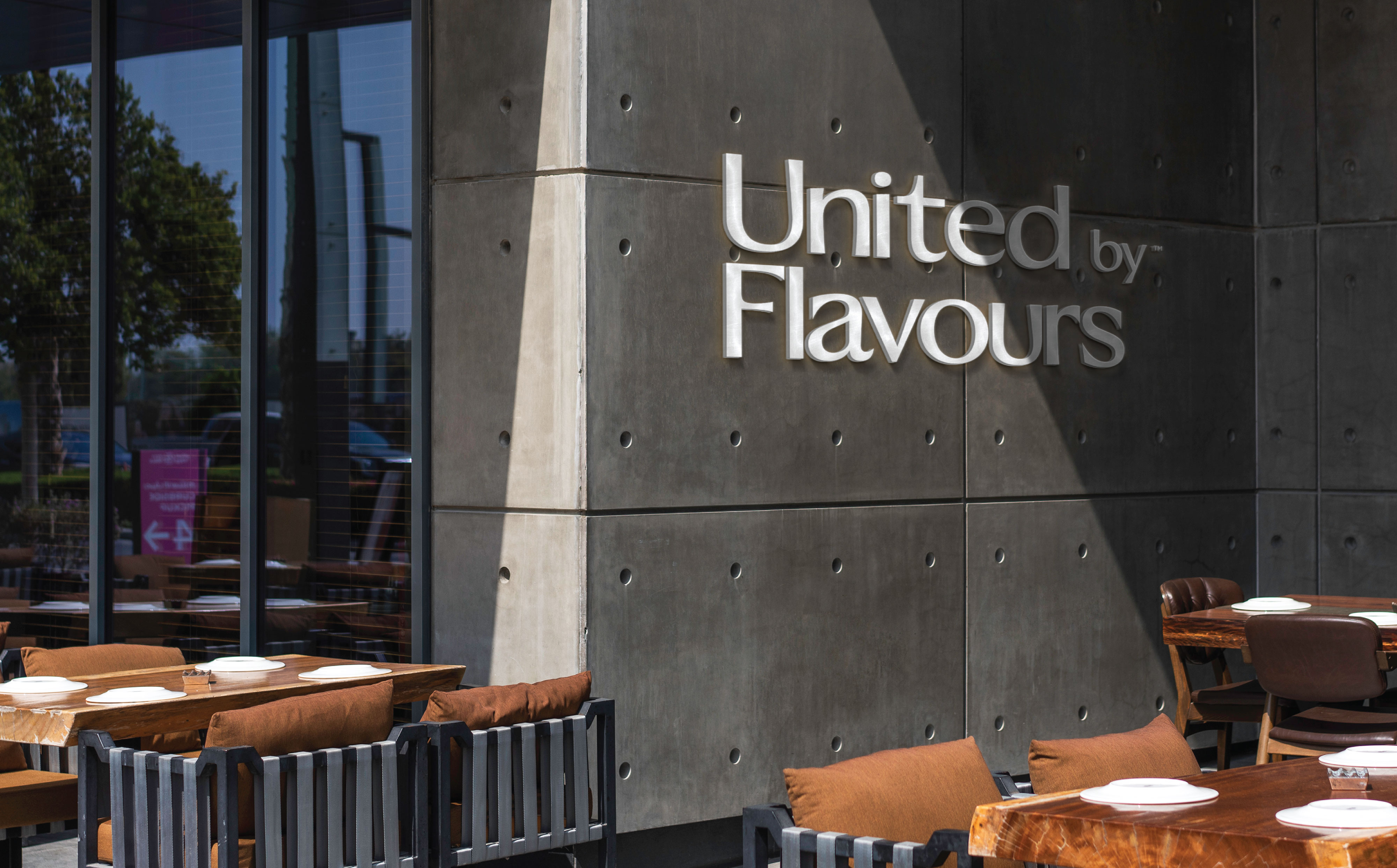
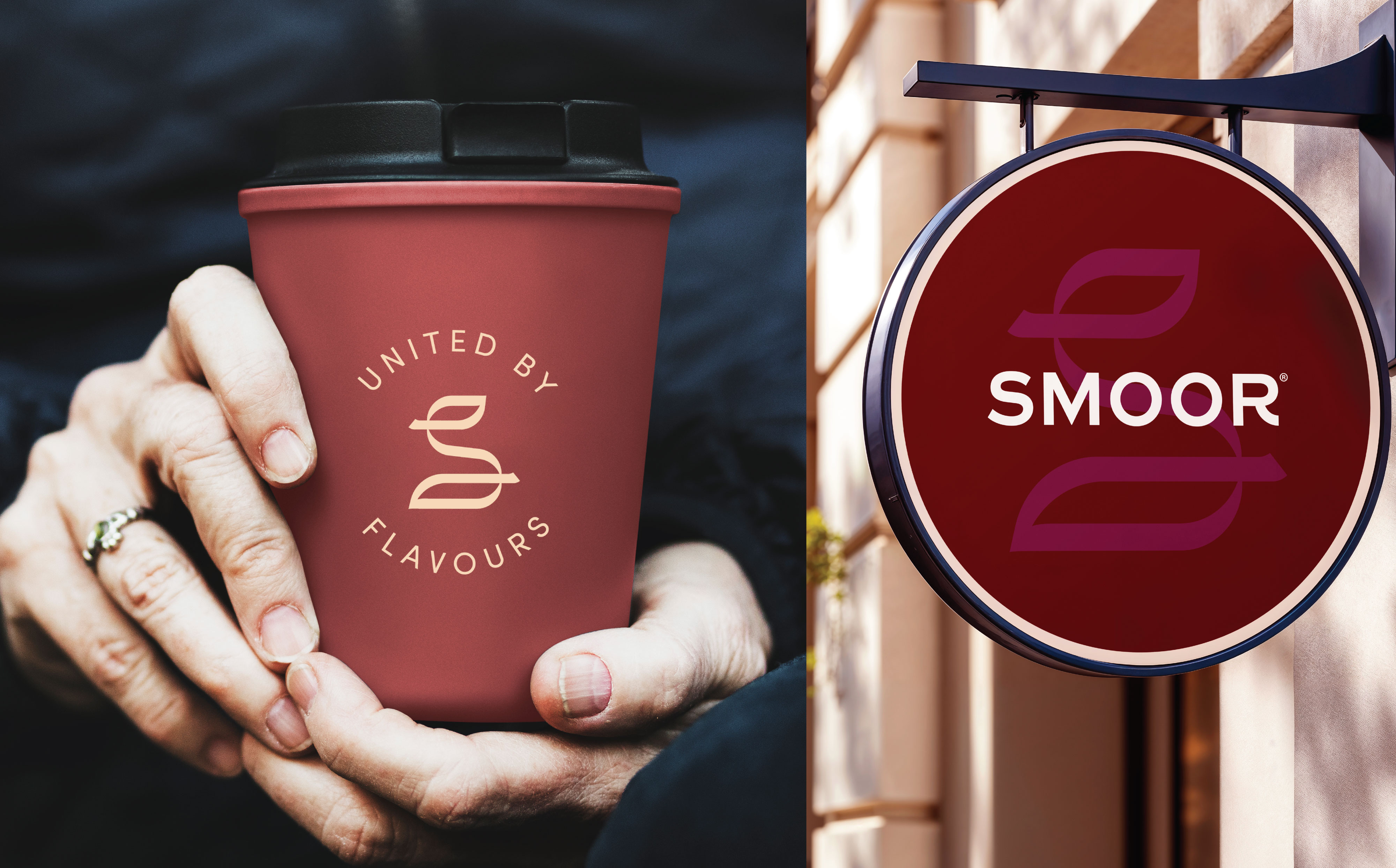
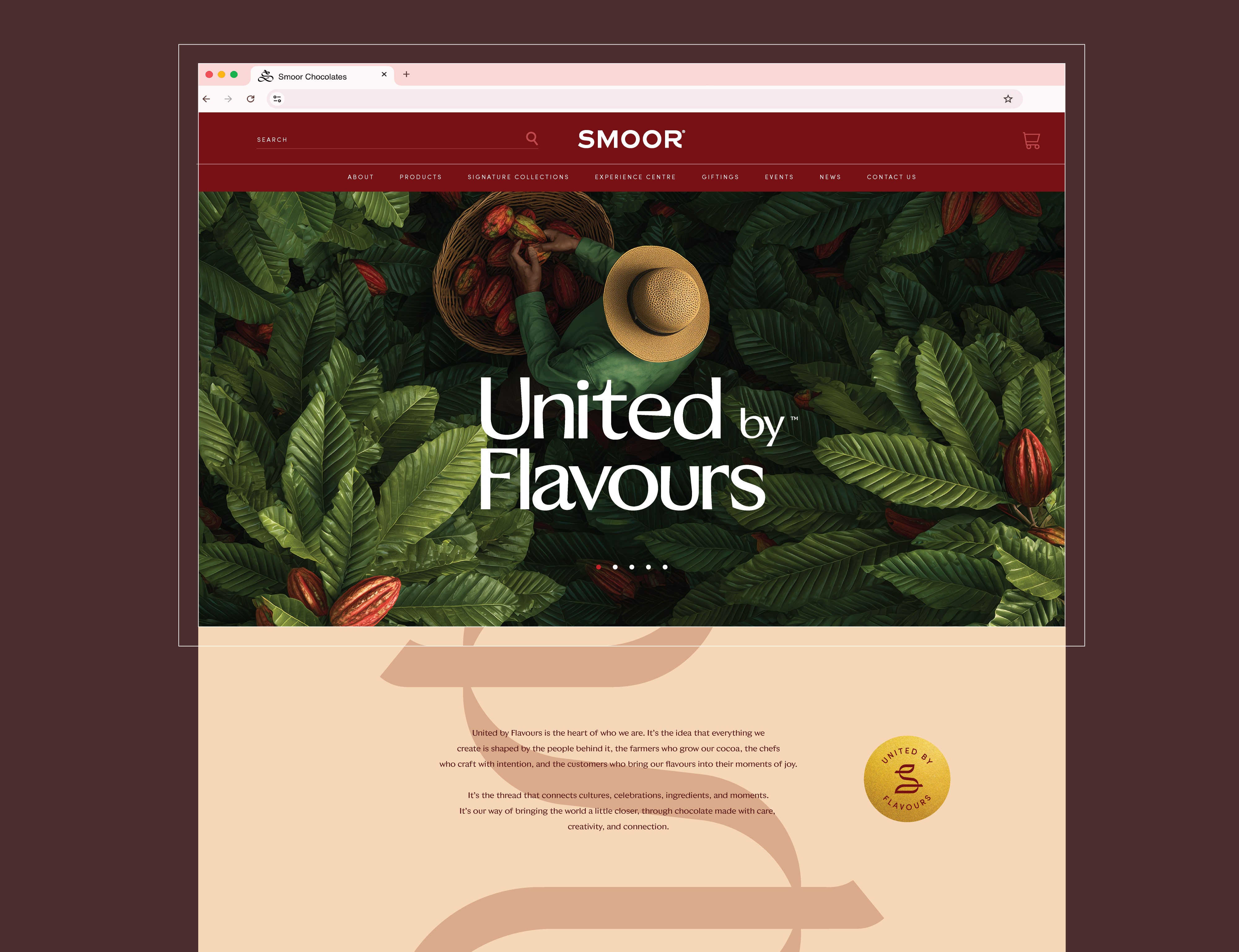
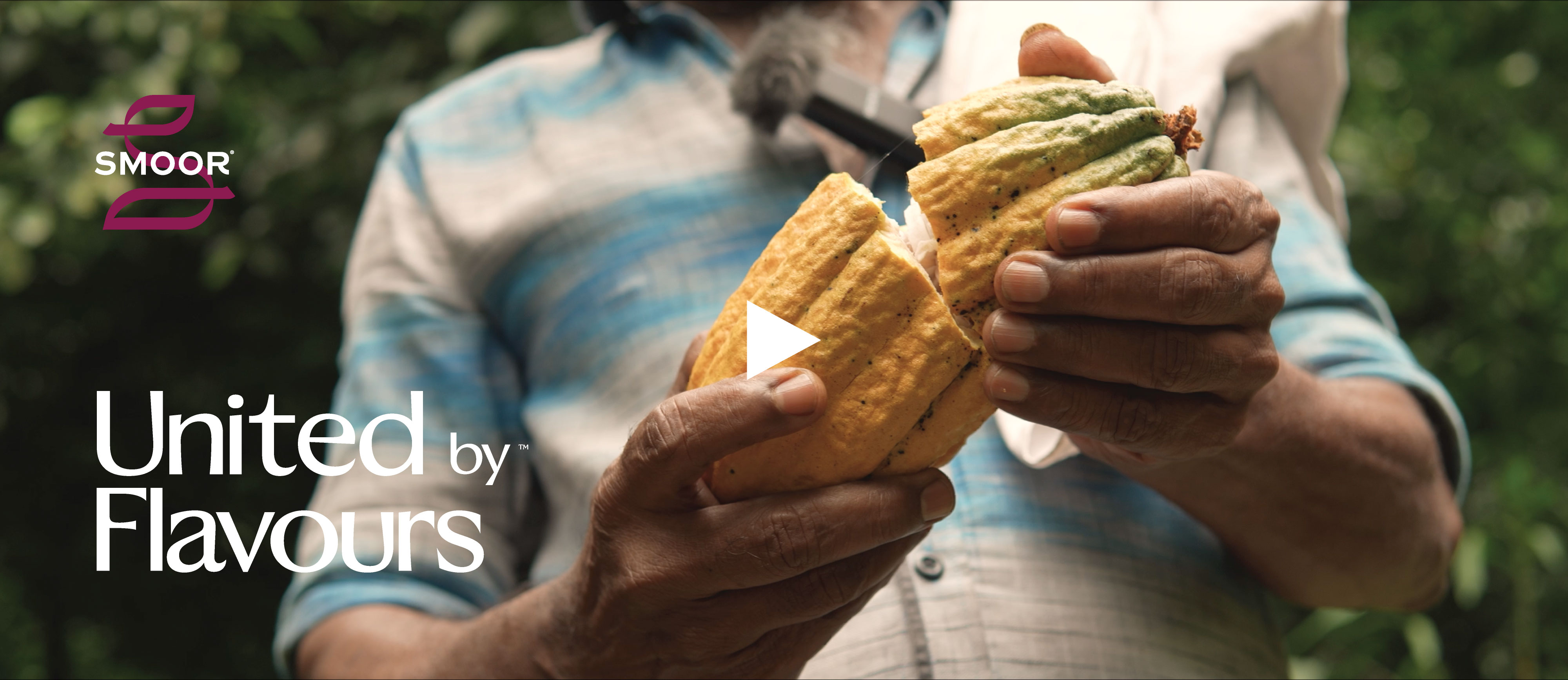
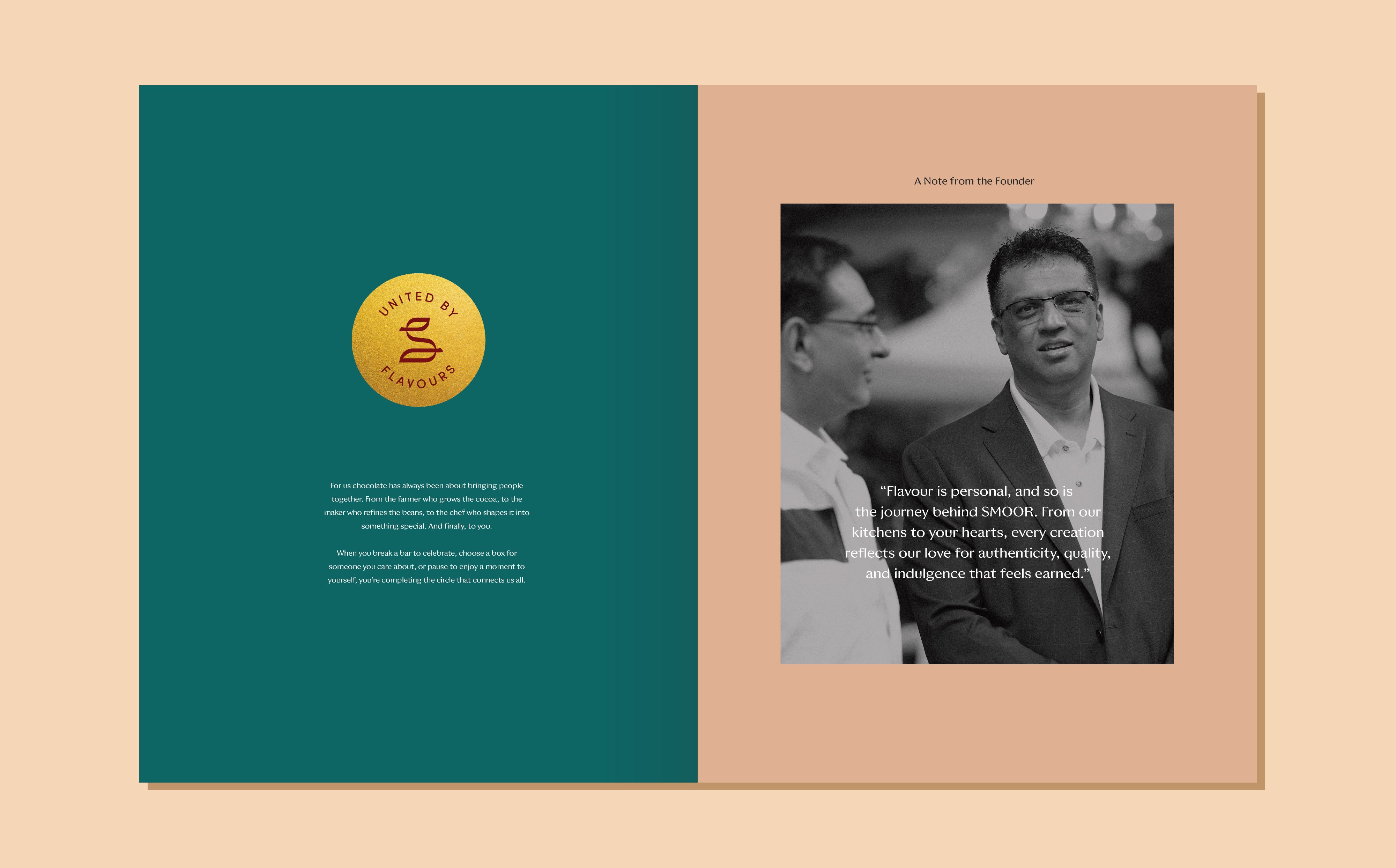
At the centre of this evolution is a simple but powerful idea: United by Flavours.
This line became more than a tagline. It became the lens through which the entire brand could be understood. Chocolate, at its heart, is about connection, farmers growing cocoa, chefs crafting recipes, teams shaping experiences, and customers sharing moments around flavour. The idea captures this entire ecosystem in a single thought.
Our role at FATLEG was to shape how this philosophy translates visually and strategically across the brand.
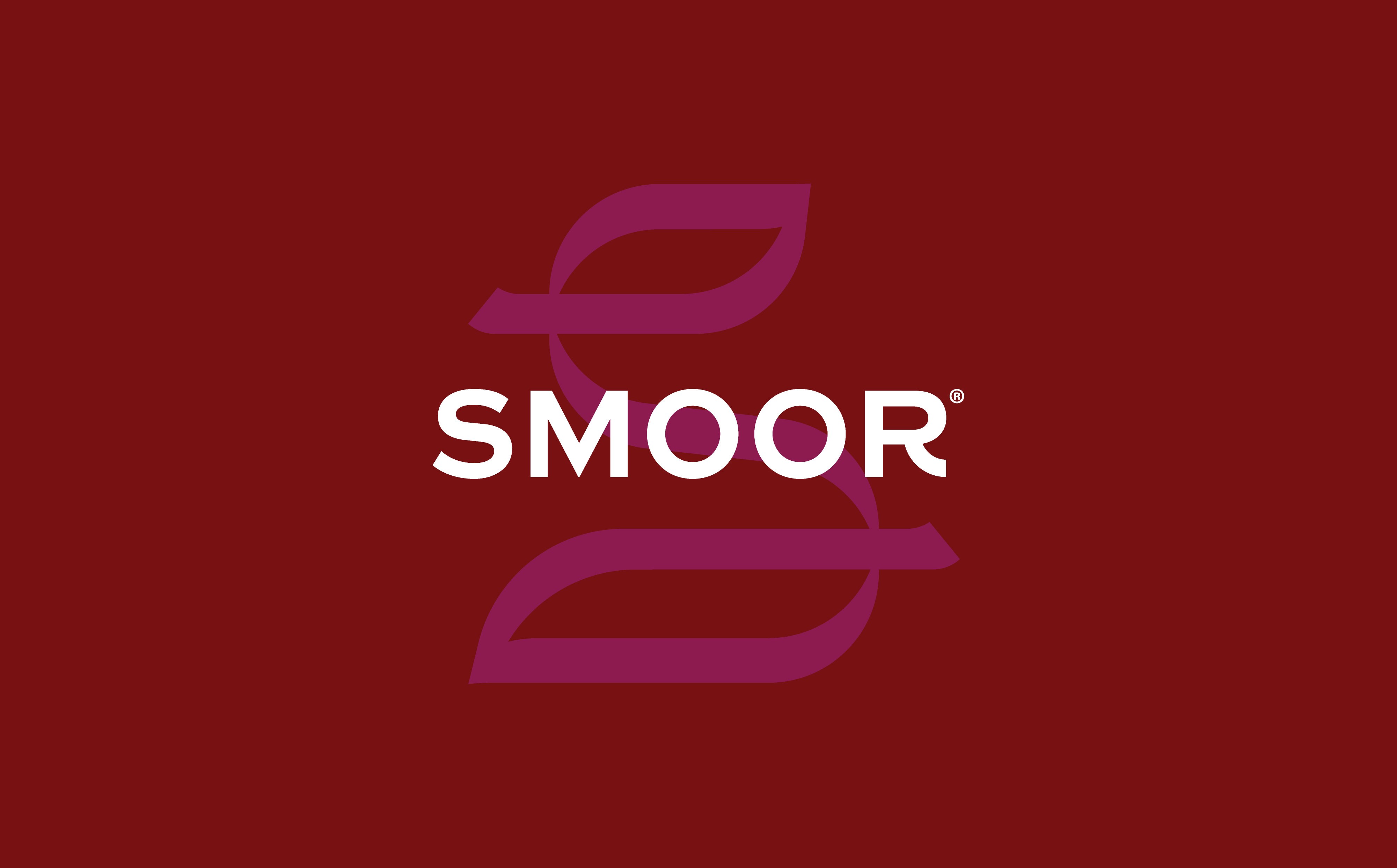
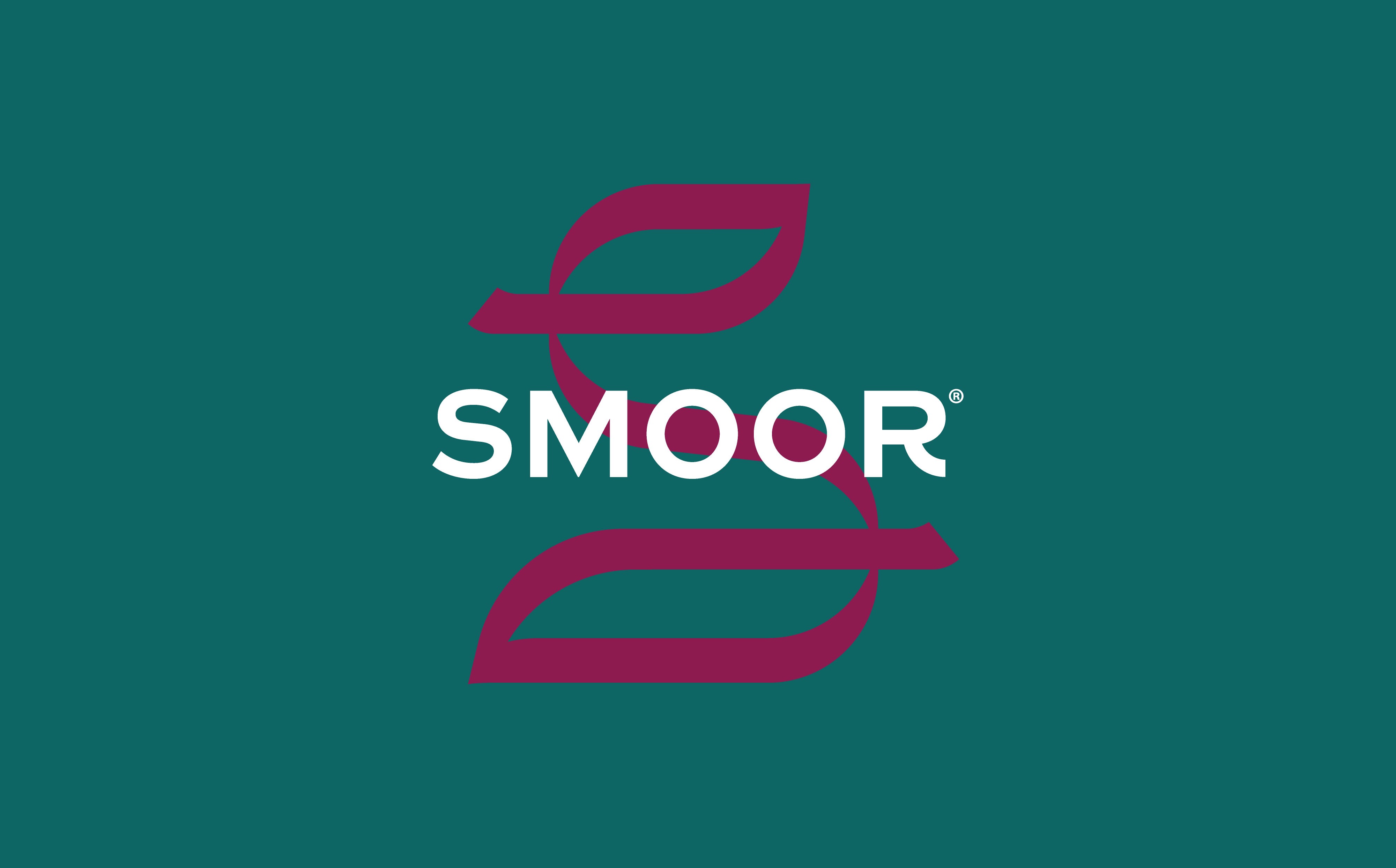
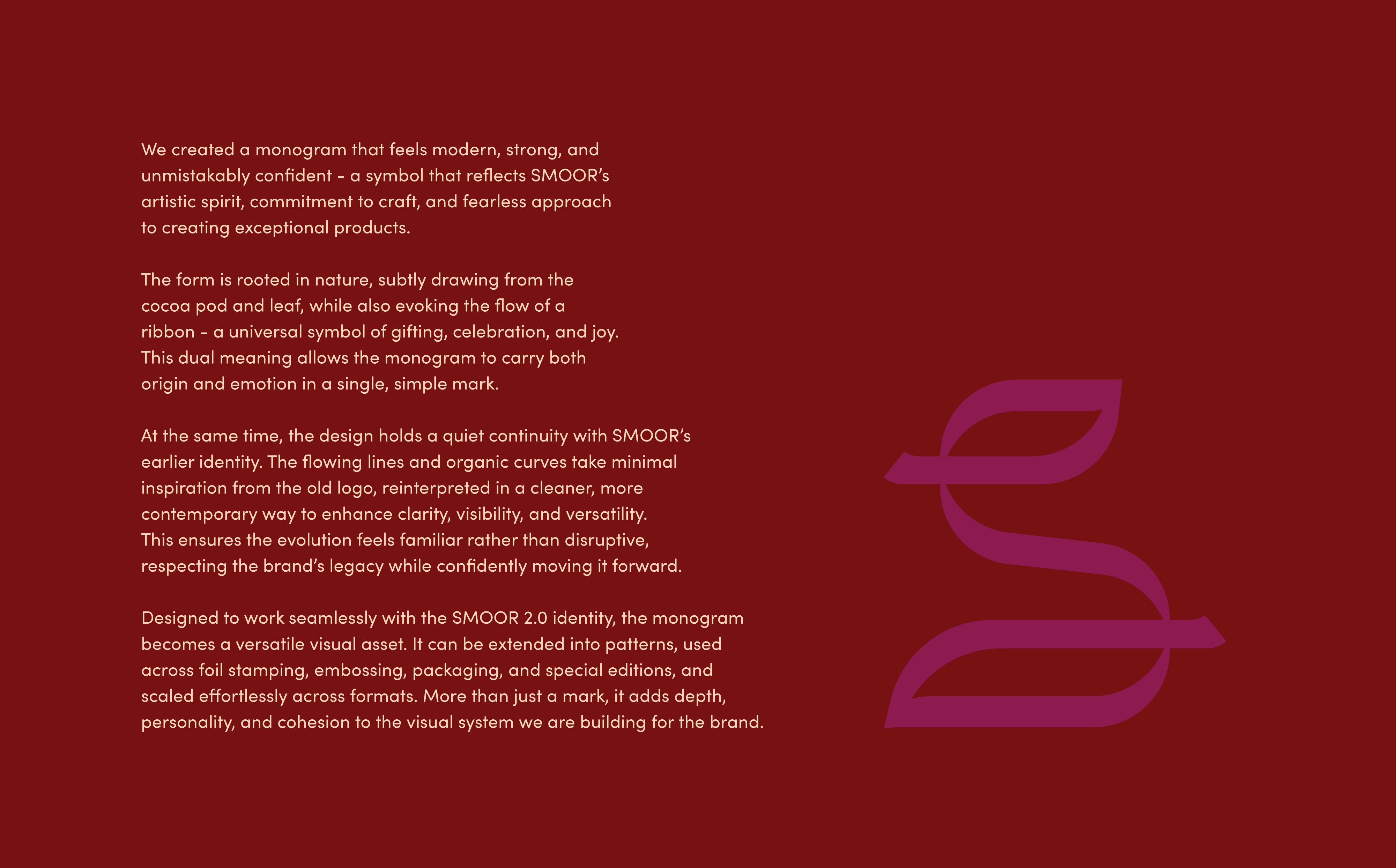
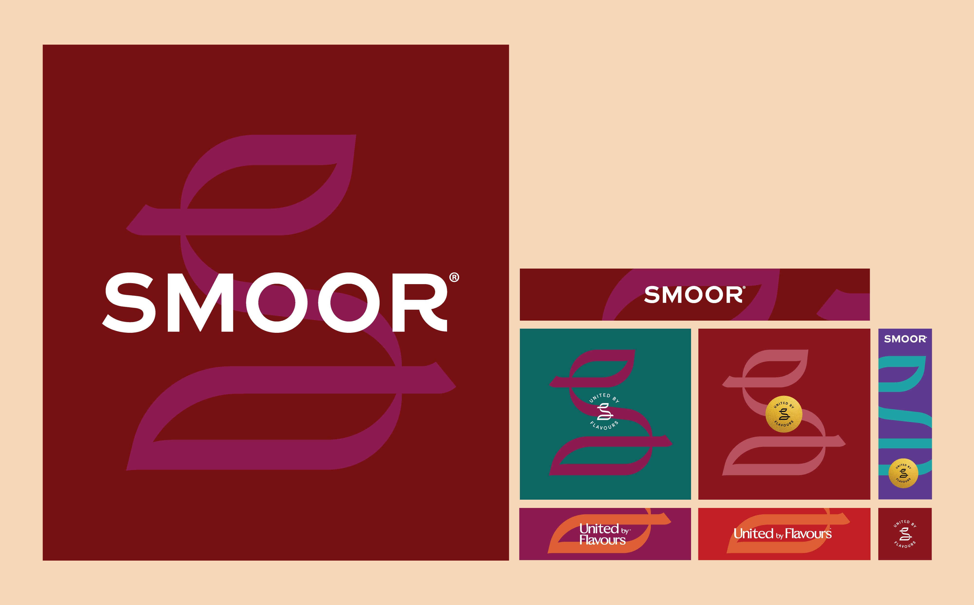
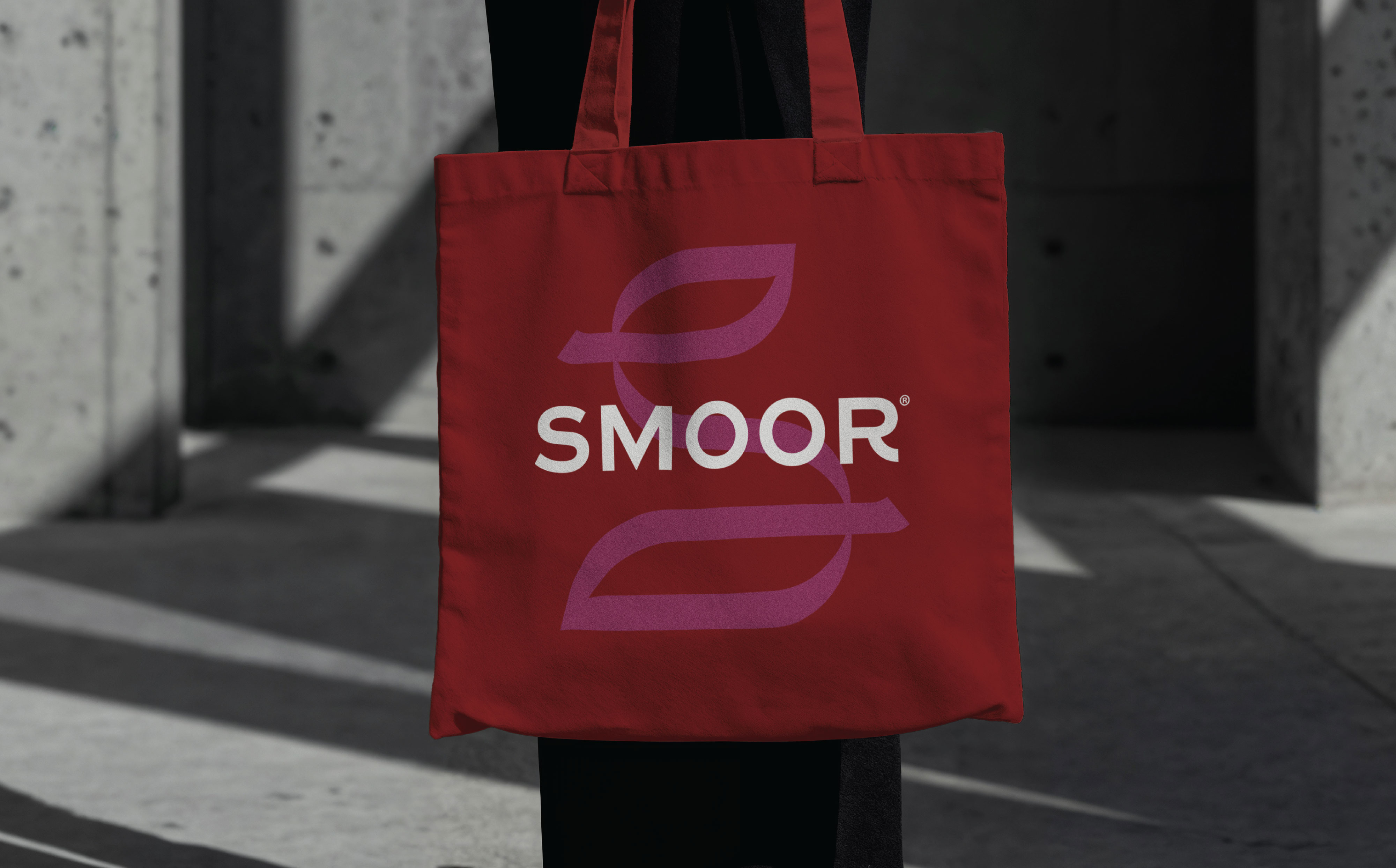
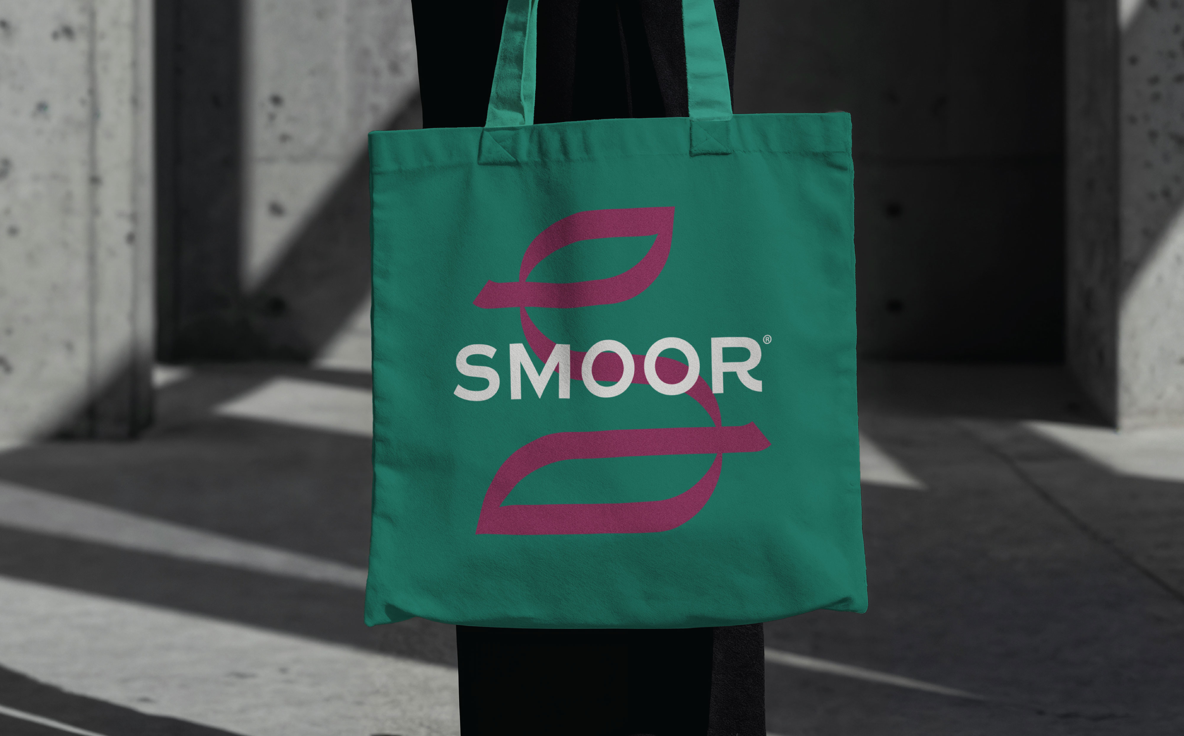
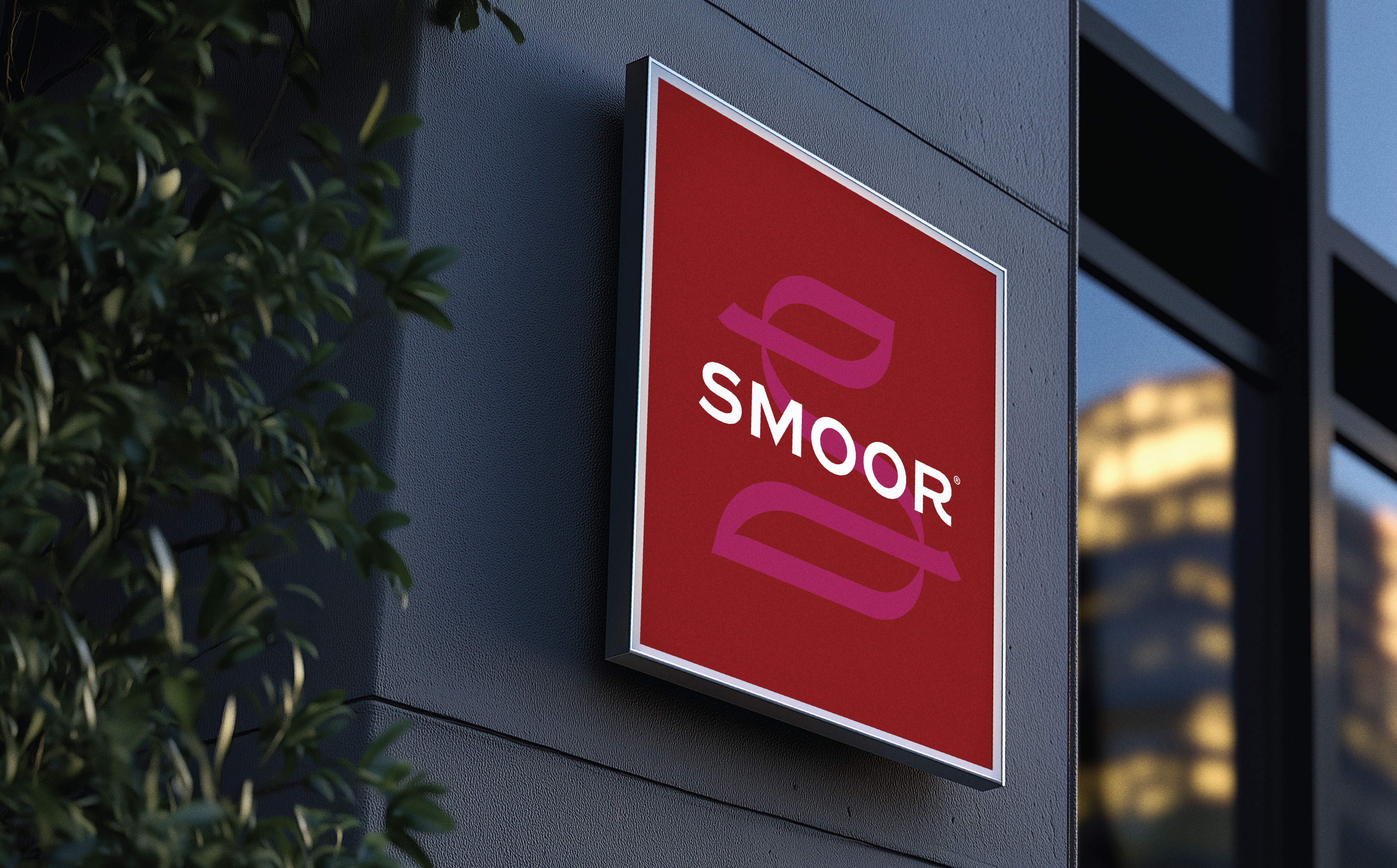
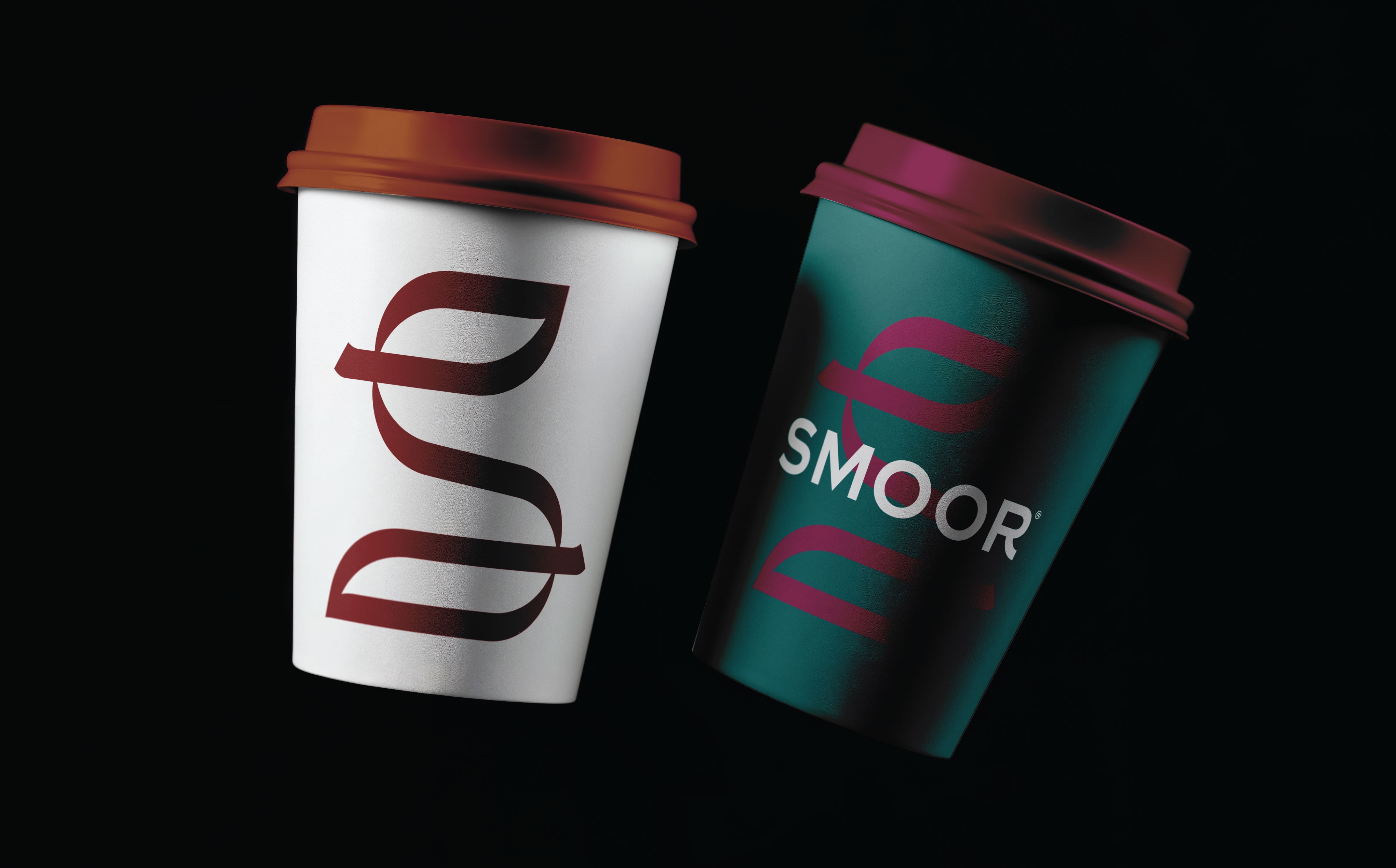
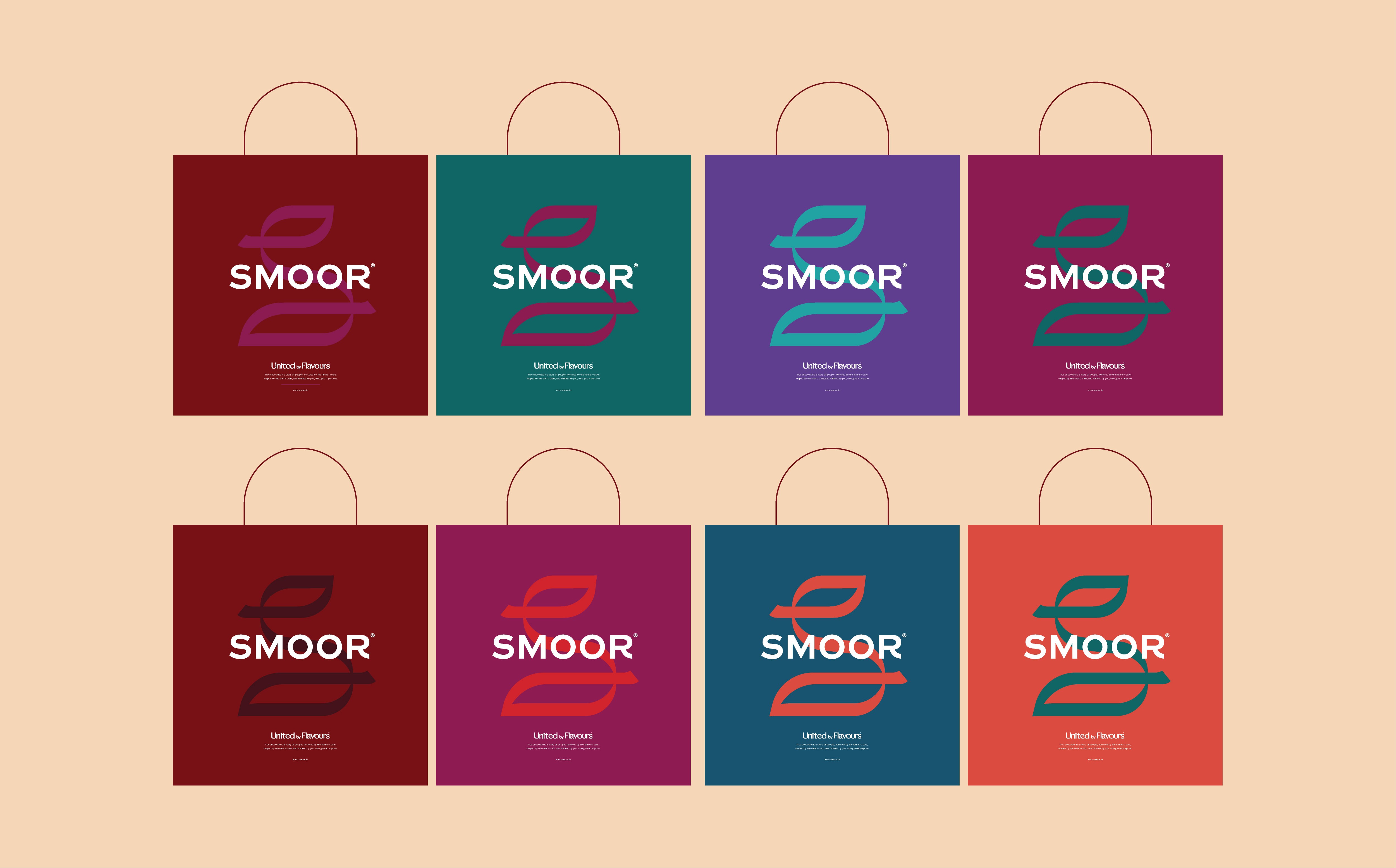
One of the key elements of this evolution was the creation of a new insignia for SMOOR. Designed as a confident monogram, the mark reflects the brand’s artistic spirit and commitment to craft. The form subtly draws inspiration from natural elements like the cocoa pod and leaf, while also evoking the flowing movement of a ribbon, a symbol often associated with celebration, gifting, and joy. This dual meaning allows the mark to carry both origin and emotion in a single gesture.
While the insignia introduces a new visual expression, it also maintains a quiet continuity with SMOOR’s earlier identity. The flowing curves take inspiration from the previous logo, but reinterpret them in a cleaner and more contemporary form. The goal was evolution, not disruption, respecting the brand’s legacy while preparing it for the future.
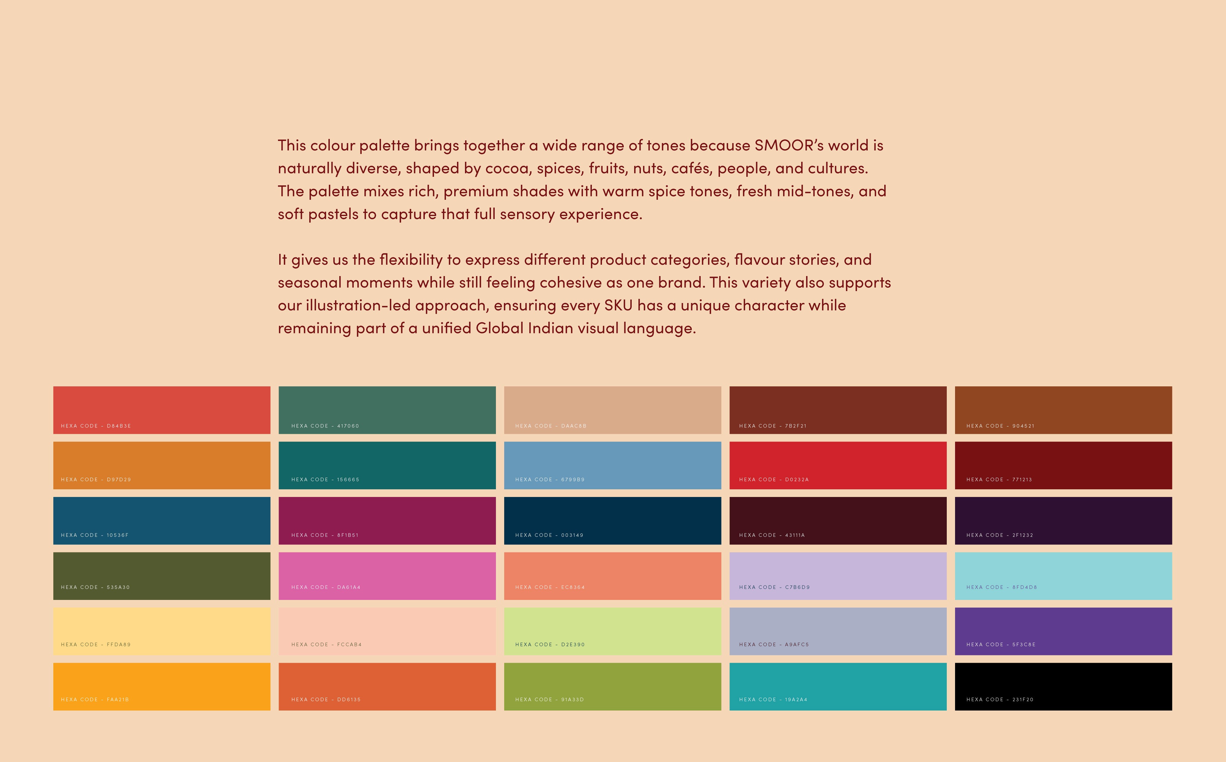
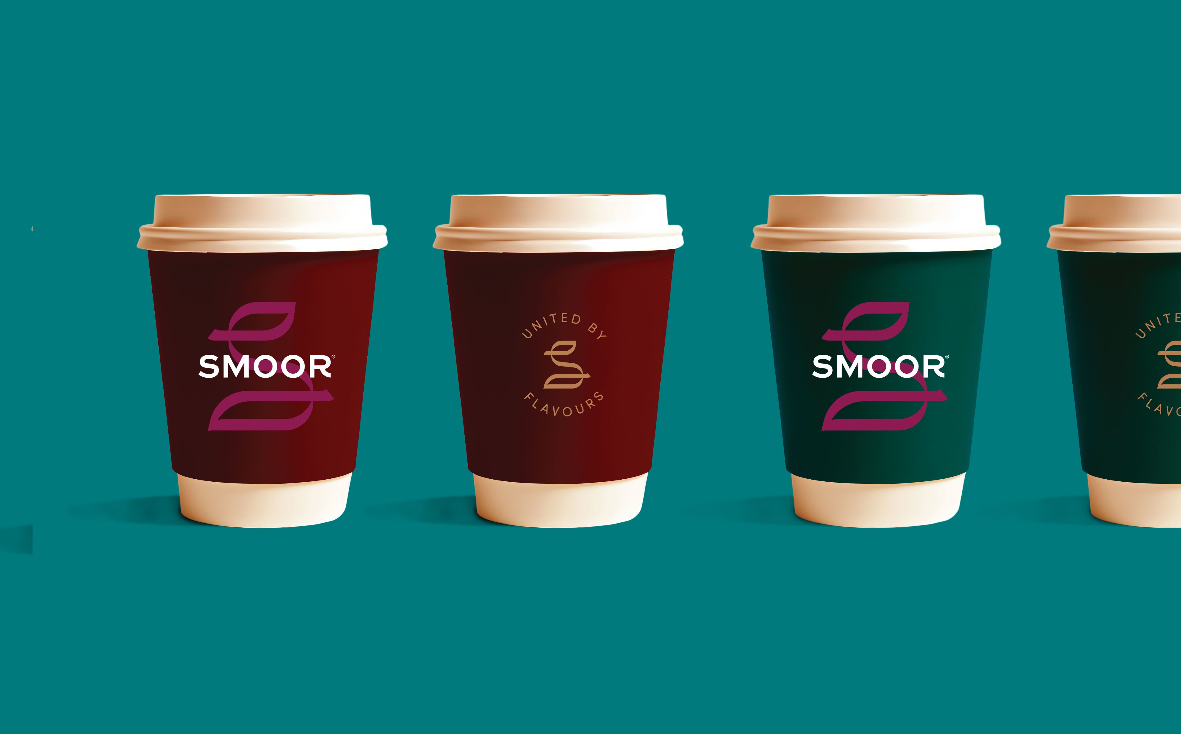
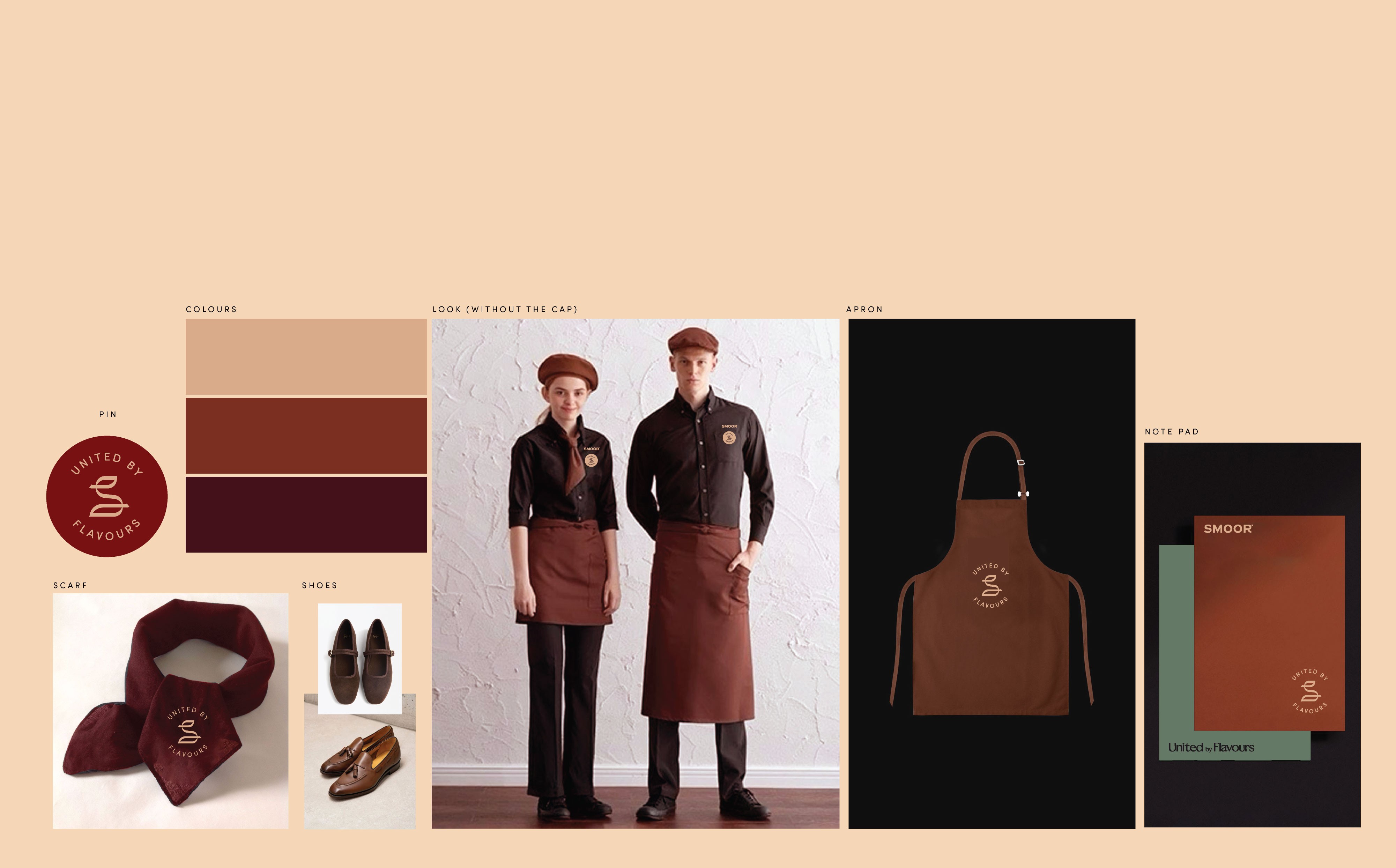
Alongside the insignia, we developed an expanded colour system for the brand. SMOOR’s world is naturally diverse, shaped by cocoa, fruits, spices, nuts, cafés, cultures, and people. The palette reflects this richness, combining premium tones with warm spice colours, fresh mid-tones, and softer pastels. This wide spectrum allows the brand to express different flavour stories and product categories while still feeling cohesive as a single visual language.
The colour system also supports SMOOR’s illustration-led storytelling approach, ensuring each product and collection can have its own personality while remaining part of the larger brand universe.
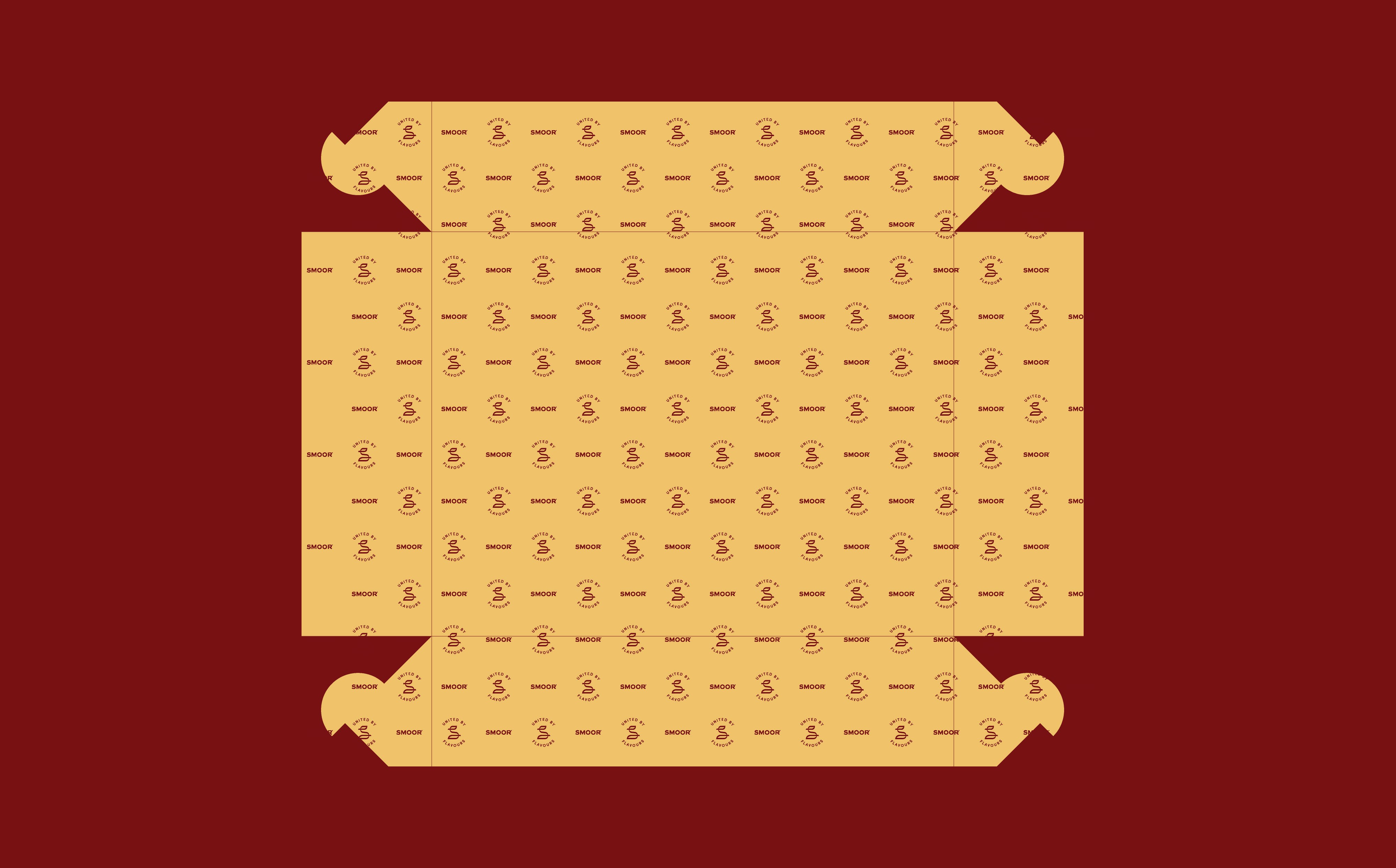
Together, the positioning, insignia, and colour system create a foundation that extends across packaging, store environments, seasonal collections, and brand communication.
Because at its core, SMOOR isn’t just about chocolate.
It’s about bringing people, cultures, and experiences together - united by flavours.