Shaping a brand that reflects how Ripple designs spaces with purpose.
Where It All Began
The Ripple Studio didn’t come to us asking for a logo. They came with something bigger, a need to express who they truly were and how they shape the world around them. They weren’t just designing interiors. They were creating environments that helped people work, live, and grow with purpose. That intention needed a name, a system, and a story. That’s where we came in.
A Name That Carries a System
The name Ripple wasn’t just a label, it was a metaphor. Good design, like a ripple, starts from a thoughtful center and expands outward, touching how people think, feel, and move through space. That thinking shaped the foundation for everything else. From it, we built their brand positioning:
“Purpose-Led Design for Work & Life.”
Not designed for show. But design that shifts behavior, inspires action, and holds space for clarity.
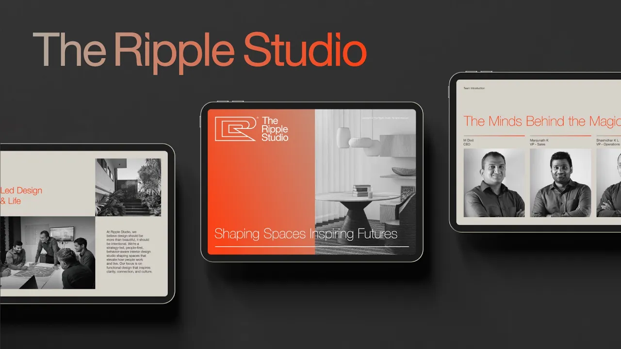
The Line That Anchors It All
We crafted the tagline: “Shaping Spaces, Inspiring Futures.” It captured everything the brand stood for:
Shaping Spaces → design backed by intent and strategy
Inspiring Futures → environments built to elevate how people live and work
This wasn’t just a nice-sounding line. It became a compass for all their communication, clear, calm, and confident.
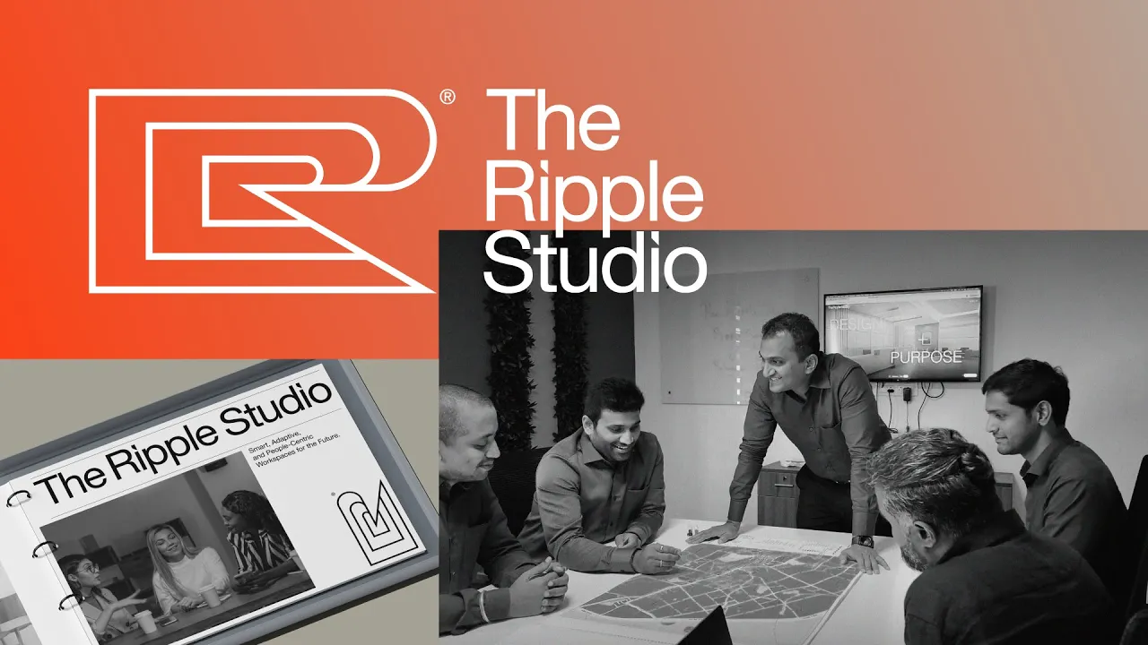
A Brand That Moves Like Its Name
From brand naming and verbal identity to visual language and scroll-based web experiences, FATLEG helped Ripple show up as exactly what it is: a behavior-aware, strategy-first design studio. A brand that thinks beyond colour palettes and furniture selections, and instead focuses on how space shapes people.
Today, Ripple speaks in two languages: spatial and visual. Seamlessly. With clarity and calm. And like its name promises, it’s already making waves.